Η Google έχει ετοιμάσει νέο τρόπο για να δείχνει search results με περισσότερο λευκό – whitespace, και χωρίς την sidebar.

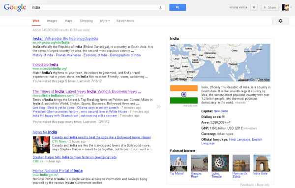
Το σχέδιο δεν είναι δοκιμαστικό και η όλη ιδέα είναι για ένα “consistent search experience… across the side variety of devices and screen sizes people use today”. Χωρίς sidebars μεταφέρει τις search options σε μια μπάρα στην κορυφή των search results page ενώ υπάρχει και χώρος για τα Knowledge Graph results.
Όλη η ανακοίνωση…
You’ll notice a new simpler, cleaner design on the search results page — we’ve been working on ways to create a consistent search experience across the wide variety of devices and screen sizes people use today. We started with tablets last year, got it to mobile phones a few weeks ago, and are now rolling out to the desktop.
With the new design, there’s a bit more breathing room, and more focus on the answers you’re looking for, whether from web results or from a feature like the Knowledge Graph:
The same advanced tools you’re used to are still there when you need them. Just click on “Search tools” to filter or drill down on your results:
It’s going out to Google.com users in the U.S. to start, and we want to get it to users in other languages and regions as soon as we can. We hope you enjoy this design refresh — let us know what you think on our Google+ page.